


Halloween Single Covers (Art Jam records)
This project was a collaboration between Abi Green, Rex McWhirter and James Thompson, a response to a brief to create a cover for the Yo Majesty halloween single 'Freak'.
What attracts us most about this piece of typography is the originality of the medium used, and the fact that the word isn't immediately legible.
The theme of the project is obviously the idea of the word 'freak', and the artists have looked to balloon animals for inspiration and created a typeface based on these. The 'freakishness' not only lies in the idea of making animals from balloons, but also the idea that a clown or entertainer at a children's party might make a perfect balloon animal, which is then passed onto other people who in turn manipulate it and turn it into a different version of that animal, the 'freak' version.
To us, the balloon shapes also express the idea of 'freak' because they suggest the idea of clowns, which many people find terrifying or creepy.
The process seems like a very intricate one, actually making the letter forms in the varying sizes and positioning them in an visually interesting way that is still legible but not boring (not having the letters simply lined up). The photography of the piece is also important in its visual impact, the black background really emphasises the shapes, which in turn seem to be suspended in mid-air, as if the balloons have just floated into shot.
The concept is really strong and executed so well that the idea almost seems effortless, despite the work that would have gone into it. We love hand-made type that uses unconventional materials and find this example really inspiring. The legibility or concept might be slightly harder to grasp for someone who doesn't have knowledge of typography, but this seems to be aimed at quite a creative crowd.
http://www.james-thompson.co.uk/Main_Work_YoMajesty.html


In her 1996 promotional design and advertisements for the rap, tap-dance musical, “Bring in ‘Da Noise, Bring in ‘Da Funk”, Scher brings the poster to life through her use of typography. Scher draws from the city and brings justice to the event by creating a visible, loud, and urban poster. The goal of this piece was to make the typography personify the noise and spirit of the tap dancing seen in the show. Her successful typographical design became an entity for this small theater. The haphazard, yet clearly thought out, choice of layout brings energy and excitement, and makes the dancer and text leap off the page. Although the text is not presented horizontally, as is most often the case, all of the information is easily understandable by the viewer. The variation in font, size, line weight, and letter spacing also brings excitement to the piece. The arrangement, structure, and use of both horizontal and vertical text is reminiscent of the layout of the streets of NYC and the letters and words become the architecture and buildings of the city themselves. Scher’s typographical design exemplifies the force of the urban culture of NYC.


Beginning in 2006, Scher began her ongoing series entitled “The Maps”. In this series she has painted numerous large scale, colorful, and typographical based images of the world. Scher meticulously hand paints these works, employing her own handwriting as font. Although these maps are inaccurate and lack precision,Scher attempts to capture the atmosphere and personal recollections of the places she paints. The inaccurate representation discards traditional notions of reference and instead acknowledges the emotional aspect, a “shortcoming of definitive maps” according to Scher. She also takes historical reference into account, such as her black and white painting of Africa (representing racial segregation), or her painting of India (which makes use of gold to represent colonial power). The dense, overlapping of information and text is similar to the information overload shereceives on the streets of NY says Scher. Although these images are unlike those of her graphic design she once again draws from her experience and the spirit of NYC.
Please visit these websites for more information:
http://www.paulascher.com/index.html
http://www.hillmancurtis.com/index.php?/film/watch/paula_scher/
http://adtv.soad.umich.edu/stamps/PWS09_scher_RC.mov
 Johnson Banks, johnsonbanks.co.uk
 ycnonline.com/julienvallee
 Unknown artisit. Located under the railway bridges in Southwark
Scientist and Starbucks.

One piece that we felt was particularly thought provoking was ‘Free’. Close up it looks like hundreds of tiny logos of different corporations such as McDonalds, Dell, Carlsberg and Nike. These logos are placed and shaded in a way that creates an almost hidden message when looked at from a distance. Above the piece it says ‘Free Choice’ in bold black letters. This is a totally readable, visible message. The choice of black on white ensures this. However, hidden in the sea of logos there is another message reading ‘...is an illusion. They want you’. This is a portrayal of the illusionary belief that we all have free choice in consumerism. The hidden words portray the unknown as they are concealed within the logos. The companies want the consumer and not the other way round because the consumer is what makes them money. Consumers, however, are conned into believing that they make their own free choices when in fact they are drawn in by advertising and branding to encourage them to consume. The use of logos to create the message is a depiction of this. At the end of the message there is an exclamation mark in bold black. This creates a shock factor on first seeing the whole piece as it stands out. All that is seen on first looking is ‘Free Choice!’ The exclamation mark represents the shock and danger of free choice as in fact, when it comes to consumerism, we do not have any.

Below are some examples of some other pieces by Yulia Brodskaya.


Andrew Byrom’s has created a mundane object into an exciting and modern typeface. There are apparently three weights to Venetian Blind typeface: Closed, Regular and Open, but I’m still to come across these. I think this font would be an unique way of dressing shop windows.


I admire Alessandra’s imaginative vision to see the alphabet letters within a chair. She simply subtracts areas of the chair. I wonder what else you could apply that technique to in order to generate other typefaces.
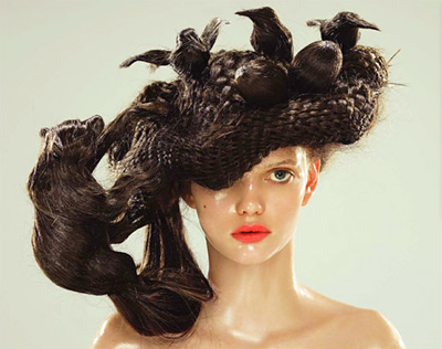
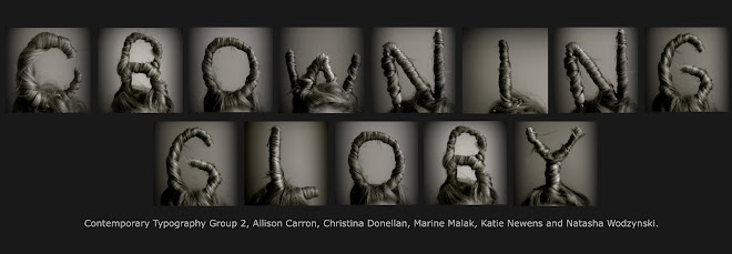
All of Alessandra’s typefaces are real, physical, and normally made from single object. She has taken this theme to another level by creating a wearable typeface. I have seen type that has been created from human bodies before but none of them were able to produce all the letters of the alphabet from a single person. It is the fluidity and flexibility, the ability to change quickly into the next letter or back to just a human, which makes this type so unique. A single person or a group of people can construct a word, a sentence or a statement for a limited length of time. As the people’s faces are visible, it helps to explain how the type is created.


Continued Research